Can AI Replace a Sign Language Avatar? A Straight Answer

It’s a question many IT managers ask when they first hear about sign language avatars: “We already have ChatGPT, isn’t that enough?”

It’s a completely fair question. AI translates text, summarizes content, and speaks many languages, so why would you need a specialized tool for the Deaf community? This article gives a direct answer, without technical complexity.

What Does ChatGPT Actually Do?

ChatGPT and similar AI tools (Gemini, Claude, and others) operate in the world of text and voice. They translate from one written language to another; Arabic to English, English to French, and so on. And they’re excellent at it.

But sign language is not a written language. It’s a visual-kinetic language built on hand movement, facial expression, and body rhythm. There is no “sign language text” for ChatGPT to translate, simply because sign language doesn’t exist in a written form that language models can process.

❌  What ChatGPT Cannot Do
ChatGPT cannot produce a visual sign language translation. It can write simplified Arabic text, but that doesn’t serve someone who learned sign language as a first language and doesn’t read well.

What’s the Real Difference Between the Two?

To understand the gap, imagine this: ChatGPT can write a recipe in five languages. But it can’t teach you to cook using sign language in front of a camera. The avatar does exactly that, it converts written words into visual movement that a Deaf person can understand.

CriterionChatGPT & General AISign Language Avatar (Hemam)
What does it translate?Text to text or voiceText to visual movement – real sign language
Does it actually serve Deaf users?Partially – simplifies text onlyYes – addresses them in their first language
Regional dialect supportNo – Saudi SL differs from Egyptian SLYes – sign language tailored per country
Website integrationRequires complex custom developmentOne line of code – Plug & Play
Sign language accuracyN/A – produces no signsBuilt and trained on Arabic Sign Language
Achieves WCAG AAA?NoYes – Sign Language criterion 1.2.6

III. What Did Academic Research Find?

In 2024, researchers from Khalifa University in the UAE published a study testing ChatGPT’s ability to translate sign language. The result was direct:

“The model failed to translate from Arabic to Arabic Sign Language, and from other sign languages to Arabic.”

This doesn’t mean AI won’t evolve in this direction; in January 2025, the UK announced the “SignGPT” project with £8.4 million in funding to build an AI model for translating British Sign Language. But that project hasn’t launched yet, and its focus is specifically on British Sign Language, not Arabic.

IV. When Is Each One the Right Choice?

✅  Use ChatGPT when you want to…
Simplify complex text into plainer language, translate written content between languages, generate marketing or administrative content, answer user queries in text form.
✅  Use a Sign Language Avatar when you want to…
Serve the Deaf community directly on your website, achieve WCAG AAA for sign language translation, address the Deaf user in their first language, not in written text, meet government digital accessibility compliance requirements.

The Bottom Line: They’re Not Competitors – They Solve Different Problems

ChatGPT is a remarkable tool for what it was built to do. But it wasn’t built for sign language translation; just as an excellent hammer isn’t used to turn screws.

A Deaf person doesn’t need simplified text, they need their language. And that’s exactly what a specialized avatar delivers: real visual translation in the sign language specific to their country, embedded in your website with a single line of code.

The difference isn’t who has the smartest AI- it’s who built their solution specifically for sign language.

Hemam Avatar was built from the ground up for this purpose, for Arabic sign languages, on real websites, with a real user experience. Try it on your website at  hemam.io 
Digital Accessibility in Government Websites: What We Can Learn from Muscat Municipality

Government websites have become the primary gateway to essential public services. From accessing information to completing online transactions, millions of people rely on digital platforms every day.

But what happens when a website isn’t accessible to everyone?

For people with disabilities, older adults, and users with different accessibility needs, poorly designed websites can create barriers that prevent equal access to information and services. That’s why digital accessibility has become a key pillar of modern digital transformation—not just a compliance requirement, but a commitment to inclusive public service.

A strong example of this approach can be seen in Muscat Municipality, which enhanced its website to provide a more accessible and inclusive experience for all users.

Building a Website That Serves Everyone

Accessibility is about designing digital experiences that work for people with different abilities, preferences, and ways of interacting with technology.

Rather than focusing solely on visual design or performance, accessible websites prioritize usability for everyone, including individuals who are deaf or hard of hearing, people with cognitive disabilities, older adults, and users who may require assistive technologies.

By integrating accessibility into the user experience, organizations can ensure that digital services remain available to every member of the community.

Case Study: How Muscat Municipality Improved Digital Accessibility

As part of its digital transformation efforts, Muscat Municipality introduced several accessibility features to make its website easier to navigate and more inclusive.

The initiative demonstrates how thoughtful technology choices can remove digital barriers while improving the overall user experience.

Virtual Sign Language Translation

One of the most notable features is a virtual sign language translator that instantly converts written website content into sign language.

This functionality is particularly valuable because many Deaf individuals consider sign language their primary language of communication. Providing information in sign language enables users to access government services more independently, without relying on third-party assistance.

Simplified Digital Content

Accessibility extends beyond assistive tools; it also includes the way information is presented.

To improve readability and comprehension, the website incorporates content simplification techniques aligned with the highest WCAG (AAA) recommendations for understandable content.

This makes information easier to process for older adults, users with cognitive disabilities, individuals with limited digital literacy, and anyone who benefits from clear, concise communication.

A More Inclusive User Experience

The website also offers accessibility settings that allow users to personalize their browsing experience according to their individual needs.

These enhancements help visitors navigate content more efficiently, interact with online services more comfortably, and access information without unnecessary obstacles.

Rather than treating accessibility as an optional feature, the project integrates it into the overall user experience.

Why This Initiative Matters

Muscat Municipality’s experience highlights an important shift in digital government: accessibility is no longer viewed as a technical enhancement; it is a fundamental component of service quality.

When Deaf users can access information in sign language, older adults can comfortably read digital content, and people with disabilities can complete online services independently, digital transformation becomes more inclusive and meaningful.

Ultimately, accessibility strengthens public trust while ensuring that government services are available to everyone.

Key Takeaways for Organizations

This case study offers valuable lessons for both public and private organizations seeking to improve their digital platforms.

Some of the most important takeaways include:

  • Treat accessibility as part of the user experience, not an afterthought.
  • Offer multiple ways for users to access information.
  • Use clear, easy-to-understand content that supports diverse audiences.
  • Design and develop websites in alignment with WCAG accessibility standards.
  • Invest in technologies that empower users to access digital services independently.

The Future of Government Websites Is Inclusive

As governments continue to expand their digital services, accessibility will play an increasingly important role in creating equitable online experiences.

Projects like Muscat Municipality demonstrate that inclusive design benefits everyone, not only people with disabilities. Accessible websites improve usability, increase user satisfaction, and help organizations deliver digital services that truly reach every member of society.

Make Your Website More Accessible

Creating an accessible website is an investment in better user experiences, stronger digital inclusion, and long-term compliance with international accessibility standards.

Hemam Toolkit provides a comprehensive suite of digital accessibility solutions, including virtual sign language translation, accessibility enhancements, and intelligent tools designed to help organizations build inclusive websites that meet WCAG requirements and serve all users with confidence. 

How Many Visits Does a Government Website Lose to Accessibility Issues? An Estimate

Every government website performance report includes visit counts, session data, and transaction completion rates. But there’s one number that never appears in any report: the users who opened the website, found it too difficult to use, and left silently; no complaint filed, no trace left behind.

That number – the silent loss – is what this article attempts to estimate with real data. Not theory: a calculation built on documented statistics you can apply to your own website.

Sources: Click-Away Pound Survey · World Health Organization 2025 · Keevee, 2025

The Formula – Three Numbers That Reveal the Loss

The calculation requires only three inputs: your website’s monthly visits, the share of visitors with disabilities, and the abandonment rate caused by accessibility barriers. These aren’t estimates, they’re documented ratios from international research.

🔢  Monthly Loss Calculation Model
Total monthly visits (example):  500,000 visits
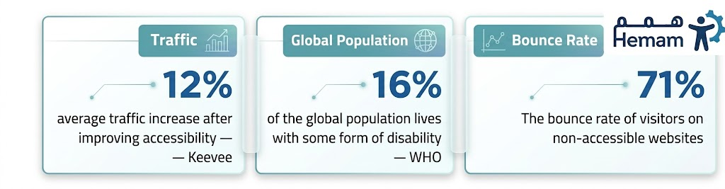
Share of visitors with disabilities (WHO):  × 16%  = 80,000 visitors
Abandonment rate due to accessibility barriers:  × 71%  = 56,800 visits
Estimated monthly loss:  56,800 lost visits

A website receiving 500,000 monthly visits is losing approximately 56,800 visits every month – more than 680,000 visits per year – due to accessibility issues alone. For a government website, each lost visit translates directly: a transaction not completed, a citizen forced to visit a physical branch, or a request left pending for no visible reason.

For Government Websites, the Loss Isn’t Only About Numbers

In the commercial sector, the loss is measured in missed sales. In the government sector, the equation is different, but no less significant:

What does a lost visit mean in the context of government services?
🏛  A transaction not completed digitally = a citizen forced to visit a physical branch, despite all digital transformation investment.
📊  Digital service completion rate drops = government performance evaluations are directly affected.
🔁  Additional burden on front-line staff = the resources digital transformation freed up are consumed again.
💔  A frustrated citizen who didn’t complain = the worst kind of feedback, because it’s never recorded and never addressed.

Accessible vs. Inaccessible – The Numbers Side by Side

A direct comparison between accessible websites and inaccessible ones, based on documented international research and surveys:

IndicatorInaccessible websiteAccessible website
Abandonment rate (users with disabilities)71%Below 20%
Transaction completion rateNoticeably lowerUp to 30% higher
ROI on accessibility investment$100 per $1 invested
Overall trafficBaseline12% higher on average
Return visit likelihood61% won’t returnSignificantly higher loyalty

Sources: Click-Away Pound Survey · Forrester Research, 2024 · Keevee, 2025

Why This Loss Doesn’t Appear in Your Reports

“The visitor who left silently is more dangerous than the one who complained – because the first one never gives you a chance to correct anything.”

Digital analytics tools (Google Analytics and similar) record the visits that happened, not the visits that should have happened but didn’t. A user who leaves within three seconds appears as a normal “bounce” in your data. There’s no way to know the reason was low color contrast or a button that doesn’t respond to keyboard navigation.

This is what makes the loss “invisible” in most reports, meaning it goes unaddressed and accumulates month after month.

Calculate Your Own Number

The formula is straightforward and applicable to any website:

📐  The Formula – Apply It to Your Website
Step 1: Find your monthly visit count from Google Analytics or your monitoring tool.
Step 2: Multiply by 16% (the share of users with disabilities, per WHO).
Step 3: Multiply the result by 71% (the abandonment rate from inaccessible websites).
Result = estimated monthly visit loss from accessibility barriers.
Example: 200,000 visits × 16% × 71% = 22,720 lost visits per month.

The Bottom Line: Numbers Clarify the Truth

This calculation isn’t about blame, it’s about understanding the real size of the opportunity. Every visit lost to an accessibility issue is a visit recoverable through specific design decisions and available tools. The government entity that moves today isn’t just correcting a mistake; it’s reclaiming its visitors, improving its performance indicators, and completing the digital transformation promise it already made.

The loss doesn’t show up in reports, because the visitor who left left no trace.

But it’s real, calculable, and recoverable.

Find out how to reclaim those visits at hemam.io 

24 Hours Without Sound: If You Were Deaf for 24 Hours Online – What Would You Lose?

A simple thought experiment: imagine waking up tomorrow and finding you’ve lost your hearing completely. Your phone is still there. The internet still works. But everything you used to consume through your ears, all of it is gone.

This isn’t hypothetical drama. It’s the daily reality of 430 million people worldwide living with disabling hearing loss. Today, you’ll live it hour by hour, to see precisely what screens designed for hearing take away from those who can’t.

7:00 AM – Waking Up to the News

07:00   A breaking news video
You open your favourite news app. A “breaking news” clip, the reporter’s face is tense, the camera shaky, they’re speaking fast. No captions. You wait. Nothing. Next clip, same. Third, fourth. Finally a written article. You learn what’s happening for the first time since you opened your phone.
What you lost: At least 8 minutes of delay before learning breaking news affecting your own area.

8:30 AM – Connecting with Work

08:30   A video meeting without real-time captions
A regular team meeting on the video platform. You open the app, no automatic captions. You ask the manager to enable them. “I don’t know how,” he says. You try from Settings yourself, the option exists but accuracy is 60%. The word “strategy” becomes “stretchery.” You decide to lip-read and hope you don’t miss anything important.
What you lost: Decisions made in the meeting that you won’t fully know until someone sends the minutes later.

12:00 PM – Lunch Break and Social Media

12:00   Social media – half a feed you can’t access
You open Instagram. A funny video; no captions. Another clip that seems hilarious because everyone’s laughing in the comments, but you don’t know why. A sports podcast. A Reel where someone speaks with great enthusiasm about something. An image with audio description only. You scroll fast, not because the content is bad, but because half of it or more is unintentionally closed off to you.
What you lost: A peer-reviewed academic study found Deaf users score 6.1 out of 7 on “feeling excluded” (the highest response).

Source: Mack et al., Social App Accessibility for Deaf Signers, peer-reviewed CHI study

3:00 PM – A Government Transaction

15:00   The e-government portal
You try to renew an official document through the digital portal. The site has instructional video guides only – no text alternative. You look for a written version – not available. You go to call support, then remember. You search for a “live chat” option, the site says “phone support is preferred for immediate assistance.”
What you lost: A transaction delayed – because every help channel assumed you could hear.

8:00 PM – Evening Entertainment

20:00   The streaming platform
You open a streaming service. You search for a film  -you always check for the “CC” icon first. You find one that looks compelling, no Arabic subtitles, English only. Another, captions exist but auto-generated at 80% accuracy, colloquial dialogue is garbled. A third option finally works. You press play. After 20 minutes of searching.
What you lost: 20 minutes of leisure time spent searching for accessible content rather than actually enjoying it.

Your Day’s Tally – What Did You Lose in 24 Hours?

TimeWhat happened?What did you lose?
07:00Breaking news with no captions8 minutes of delay learning news affecting your area
08:30Work meeting with incomplete captionsImportant decisions arrived late or incomplete
12:00Social media partially blockedSocial exclusion: clips and laughs you’ll never understand
15:00Government transaction stalledAn extra working day to finish a routine task
20:0020 minutes searching for accessible contentRest time turned into search time

“I feel excluded when I see everyone laughing at a clip I can’t understand. The problem isn’t my ears — it’s the decision made by whoever designed that clip.”

Direct quote from an interview in: Mack et al., Social App Accessibility for Deaf Signers (CHI 2021)

What’s the Difference Between a Website That Receives You and One That Doesn’t?

This hypothetical day isn’t pessimism; it’s a description of the current reality on most digital platforms. But the difference between a frustrating experience and a smooth one isn’t about rebuilding everything from scratch. It’s about specific decisions:

✅  What Makes the Day Different?
Accurate text captions for video, turns 7 a.m. from frustration into information.
A sign language avatar on primary content – addresses the Deaf user in their first language, not their second.
Text-based support options as an alternative to phone – because a Deaf user can’t make a voice call.
A site structure that announces content to screen readers and assistive devices.

The Closing: 24 Hours Is Enough to Understand

Today, you didn’t lose your ability to achieve or your enthusiasm for life. You simply experienced what it feels like when the digital world is built on the assumption that everyone can hear.

Deaf users are not asking for a special or separate experience. They are asking for something much simpler: that the digital experiences we create do not become barriers that cut them off from the world.

Now that you’ve spent these 24 hours in their shoes, imagine facing the same challenge every single day of the year. Then imagine you’re the one behind the screen – designing websites, products, or platforms – with the power to change that reality.

Don’t let inaccessible design stand between you and your users. Create digital experiences that everyone can use. Start your journey toward digital inclusion today with hemam.io 

News & Digital Accessibility: When News Excludes the Deaf 

“Breaking: earthquake strikes the region.” The story spreads in seconds across every app. A reporter stands at the scene, voice tense, describing what they see. Everyone knows now, except anyone who can’t hear it.

This isn’t a rare scenario. It happens every single day, in every video news bulletin, every political podcast, every breaking clip published at lightning speed with no captions. Journalism’s entire promise is reaching everyone at the same moment, but the accessibility reality reveals that promise isn’t kept equally for everyone.

I. Why Are News Captions Different From Any Other Content?

In entertainment or marketing video, missing captions means a missed experience. In news content, the stakes are fundamentally different: breaking information may directly concern the user’s own safety; a security warning, a health emergency, a political development requiring an immediate decision.

When a breaking news clip fails to reach a Deaf user because the video has no captions, that’s not a marketing oversight; it’s exclusion from potentially life-relevant information. That is what makes accessibility in digital media a higher responsibility than in almost any other sector.

II. The Global Landscape – Solutions Born from a Gap Too Big to Ignore

The gap in mainstream media was wide enough that the Deaf community built its own entirely sign-language-based news platforms, because mainstream outlets weren’t serving them adequately:

PlatformLanguageCore Feature
The Daily MothAmerican Sign Language (ASL)Founded by a Deaf journalist (full news coverage entirely in ASL)
Sign1NewsAmerican Sign Language (ASL)Partnered with CNN for global news coverage in ASL
Media’Pi!American Sign Language (ASL)An entirely Deaf journalist team (content by and for the community)

Source: Hearview, Deaf News Platforms Report 2025

The existence of fully independent sign-language news platforms is, in fact, a dual signal: it reflects beautiful determination from the Deaf community to access information, but it also reflects mainstream media’s failure to serve them within the main platform itself. The healthy solution isn’t isolating the Deaf audience onto a parallel platform; it’s integrating accessibility into the primary platform itself.

III. What Specifically Fails in Digital Newsrooms?

  • Breaking news videos with no real-time captions – the most recurring accessibility failure across every global study.
  • Inaccurate automated captioning – automatic speech recognition reaches only about 80% accuracy, insufficient for news content that depends on precise figures and names.
  • Political and analytical podcasts with no accompanying transcript – entirely excludes Deaf audiences from a full category of deep news content.
  • Live-streamed press conferences with no real-time interpretation – making the single most important moment in the story (the conference itself) unavailable when it actually happens.

“News that arrives an hour after its original publication isn’t the same news; it’s late news.”

IV. The Fix Isn’t as Expensive as It Looks

The common assumption in newsrooms is that accessibility requires a dedicated team and a substantial budget. The reality: modern technical solutions have become accessible through specific, practical steps:

🎯  Three Practical Steps for a Digital Newsroom
Real-time captions for breaking news video – an absolute priority, even if automated at first with later human review.
A sign language avatar on primary content – converts written or spoken text into direct visual translation, especially for breaking and high-priority stories.
A site structure that supports screen readers – for users with visual impairments who rely on written text for news.

The Bottom Line: When Speed Is the Selling Point, it Has to Be for Everyone

Journalism prides itself on speed – “we were first,” “breaking before everyone else.” But speed that doesn’t reach the entire audience isn’t a complete advantage, it’s an incomplete one. The news platform that reaches everyone at the same moment is the platform that truly understands what “news” means: information reaching the person who needs it, when they need it, in a form they can actually receive.

News should reach everyone at the same moment- not only after someone asks for help.

Whether your platform is a newsroom, an institution, or a government service, digital access starts with one step.

Get in touch with Hemam at  hemam.io 

The State of Digital Accessibility in Saudi Arabia 2025: Numbers That Reveal the Real Gap

Saudi Arabia- and the Gulf region as a whole – is advancing rapidly in its digital transformation journey, backed by significant investments in digital infrastructure and online services. But amid this remarkable progress, one important question often goes unanswered:

Are these digital services truly accessible to everyone?

In this article, we compare Saudi Arabia’s digital transformation indicators with the latest global accessibility data to uncover the gap between having world-class digital infrastructure and delivering digital experiences that everyone can use.

Saudi Arabia’s Digital Landscape: Strong Foundations for Digital Growth

Let’s begin with the positive picture; it deserves recognition.

Today, Saudi Arabia is among the world’s most connected nations, with widespread internet access, high smartphone adoption, and extensive reliance on digital services across both the public and private sectors.

99%
Internet penetration in Saudi Arabia, 2025
95%+
Smartphone penetration across the Kingdom
33.9M
Saudi internet users at the start of 2025

Sources: General Authority for Statistics (GASTAT), DataReportal

These figures reflect a highly advanced digital infrastructure, world-class internet connectivity, and a strong foundation for continued digital innovation.

However, they raise another important question:

Can every user benefit equally from these digital services – including people with disabilities?

What Do Websites Tell Us?

While digital infrastructure continues to improve, global research shows that digital accessibility remains a significant challenge.

One of the most comprehensive studies in this field is the WebAIM Million Report, which analyzes the homepages of the world’s top one million websites each year against the Web Content Accessibility Guidelines (WCAG).

Although the report does not specifically assess Saudi websites, it provides a reliable benchmark for understanding the accessibility issues that continue to affect modern websites worldwide.

Metric20242025Trend
Pages with detectable WCAG errors95.9%94.8%Slight improvement
Average accessibility errors per homepage56.850.0Slight improvement
Pages with low color contrast79.1%Most common issue
Pages with images missing alternative text55.5%One of the most impactful issues
Pages missing a declared language attribute15.8%Affects screen reader performance

Source: WebAIM Million Reports (2024 & 2025)

Despite modest improvements, the overwhelming majority of websites still contain accessibility barriers that prevent many users from fully accessing their content or completing essential tasks.

Perhaps the most striking finding is that six years of incremental improvements have resulted in only modest progress, highlighting that the challenge today is not a lack of awareness, but the slow adoption of accessibility best practices during design and development.

Who Pays the Price for This Gap?

According to the World Health Organization (WHO), more than one billion people – around 15% of the global population – live with some form of disability.

This is far from a niche audience. It represents a significant portion of society in every country, including Saudi Arabia, where people with disabilities rely on digital services for education, banking, healthcare, government services, employment, and online shopping just like everyone else.

When accessibility is overlooked, seemingly minor technical issues become real barriers in everyday life.

For example:

  • Poor color contrast can make an online government form unreadable for users with low vision.
  • Images without alternative text can prevent blind users from independently accessing banking or e-commerce services.
  • Forms that cannot be navigated by keyboard may stop users with motor disabilities from completing purchases.
  • Videos without captions can prevent deaf students from fully accessing educational content.

Digital accessibility is not simply a technical requirement; it is fundamental to creating equal access to digital services.

Bridging the Gap Between Vision and Implementation

Across the Gulf region, national digital transformation strategies – including Saudi Vision 2030 – emphasize building inclusive digital societies where services are available to everyone.

Yet achieving this vision requires more than fast internet connections and modern platforms.

It depends on the countless design and development decisions that determine whether a digital service is usable for every individual.

Every image without alternative text, every unlabeled form field, and every interface with insufficient color contrast creates another barrier, regardless of how advanced the underlying technology may be.

This is the real gap: not between ambition and capability, but between strategic vision and everyday implementation.

Conclusion: The Infrastructure Is Ready – Is the Experience?

Saudi Arabia has built one of the world’s strongest digital ecosystems, with 99% internet penetration and widespread adoption of digital services.

At the same time, the latest global research shows that 94.8% of website homepages still contain detectable accessibility issues.

While this figure does not specifically represent Saudi websites, it highlights a global reality: digital accessibility remains an ongoing challenge, and any organization that does not actively evaluate its digital platforms may face the same issues.

The encouraging news is that accessibility gaps are measurable, and, more importantly, they are solvable.

By assessing digital experiences, identifying accessibility barriers, and implementing recognized accessibility standards, organizations can make meaningful progress toward building digital services that truly serve everyone.

The numbers are clear, and the gap can be measured.

The only remaining question is:

Can everyone use your website with confidence, or are some users leaving before they even have the chance to engage with your services?

Start evaluating your website’s accessibility today and identify potential barriers before your users do.

Test your website for free at  hemam.io 

Lost in the Web: A Blind User’s Three-Hour Journey.

Khaled is 34. He works as an accountant at a company in Riyadh. He uses the internet daily: for work, for errands, for everything everyone else uses it for. His vision began declining in his mid-twenties and was completely gone four years ago. He now navigates entirely with the NVDA screen reader and a keyboard. No mouse. No touch screen.

What follows is not fiction. It is his ordinary Tuesday.

8:15 AMHe needs to renew a subscription to a cloud service

Khaled opens his browser and navigates to the website. His screen reader begins reading the page, and this is where the first problem starts.

🔊  What Khaled’s screen reader reads aloud:

“Link. Link. Image. Button. Link. Link. Link.”

“Click here. Click here. Click here. Click here.”

Four consecutive links all labelled “Click here.” No context. No description. Khaled cannot tell which one leads to the subscription and which leads to cancellation. He tabs through the page repeatedly, trying to assemble a mental picture from scattered fragments.

Nine minutes later, he finds the right link. A task that takes any other user two minutes has taken him eleven.

🔍  What’s the technical problem?

Links without descriptive text –  the screen reader has nothing to say except “link”

Images without alt text – some are read as file names: “img_2847_final_v3.png”

The fix: real descriptive text for every link and every image – three minutes of work ends an hour of frustration

9:40 AMHe tries to book an appointment at a medical clinic

The clinic has a beautifully designed website; animated transitions, harmonious colors, a polished interface. To anyone who can see it. For Khaled:

🔊  What Khaled’s screen reader reads aloud:

“Calendar. Graphic. Element. Element. Element.”

“Monday Tuesday Wednesday – not clickable.”

“Button: undefined.”

The date picker is built entirely in custom JavaScript that doesn’t communicate with assistive technologies. Interactive buttons carry no accessible names. The calendar is visually present – but effectively invisible to a screen reader.

“Sometimes I discover that what I thought was a button is just a decorated div. I press it ten times, and nothing happens.”

Khaled gives up. He asks his wife to book the appointment on his behalf. Not because he is incapable, but because the website decided that for him.

🔍  What’s the technical problem?

Interactive elements built on <div> instead of <button> – not recognized as buttons

Custom date pickers without ARIA support – unreadable to screen readers

The fix: use correct semantic HTML first, then ARIA only where HTML has no native equivalent

11:10 AMHe attempts to complete a government transaction online

The government portal requires a CAPTCHA – images to be visually identified. No audio alternative. No other option.

🔊  What Khaled’s screen reader reads aloud:

“CAPTCHA. Image. Please verify you are not a robot.”

“Text field: Enter the text shown in the image.”

The text shown in the image. Khaled cannot see the image. There is no “Listen to the code” button. No link saying “Contact us for an alternative.” The digital door is locked with a key he was never given.

He will need to take a day off to visit the physical service office – the exact trip the portal was designed to replace.

🔍  What’s the technical problem?

Visual-only CAPTCHA with no audio or logical alternative — blocks access entirely

WCAG criterion 3.3.8 (Level AA) now explicitly prohibits this

The fix: audio CAPTCHA, SMS verification, or a simple logical challenge

Three Hours – Three Walls

In 3 hours, Khaled encountered three websites and three entirely different barriers. He had no difficulty understanding. No difficulty deciding. He ran into code that was written without him in the room.

The numbers say more than 285 million people worldwide live with visual impairment. Across the Arab world, millions of them go online every day and hit the same walls.

“I don’t want a special experience made for me. I want the same experience.”

That sentence says everything. Digital inclusion doesn’t mean building a simplified version for blind users – it means building one website that works for everyone, correctly, from the start.

How many people like Khaled visit your website every day and leave silently?
Khaled’s day has ended… but tomorrow will bring the same challenges unless the websites he uses change.

Change starts with a simple decision: to design digital experiences that don’t exclude anyone.

With Hemam Tools, you can identify accessibility barriers on your website and remove them, so your services become truly accessible to everyone, without exception.

The Common CSS Mistakes That Make Your Website Fail Accessibility Audits

Every accessibility audit tends to uncover the same recurring issues, and surprisingly, many of them can be traced back to just one or two lines of CSS.

The problem isn’t careless developers; it’s that many of these patterns have become common habits inherited from outdated tutorials and boilerplates that were never designed with accessibility in mind.

In this article, we’ll walk through five of the most common CSS accessibility mistakes, supported by WebAIM Million 2024 data, along with practical code examples to fix them.


1. Removing outline: none Without a Replacement

This is arguably the most harmful accessibility mistake found in CSS.

According to the WebAIM Million 2024 report, nearly 78% of websites have detectable focus indicator issues.

The most common reason?

❌ Avoid this

* {
    outline: none;
}

/* or */

button:focus {
    outline: 0;
}

Removing the focus indicator makes keyboard navigation extremely difficult for:

  • Keyboard-only users
  • People with motor impairments
  • Screen reader users
  • Anyone navigating using the Tab key

✅ Do this instead

button:focus-visible {
    outline: 3px solid #005FCC;
    outline-offset: 3px;
}

Using :focus-visible displays the focus indicator only for keyboard navigation without affecting mouse users.

Recommended: Ensure the outline has at least a 3:1 contrast ratio against the adjacent background.


2. Color Contrast That Fails WCAG

Insufficient color contrast is the single most common accessibility failure, affecting 83.6% of websites according to WebAIM 2024.

WCAG requires:

  • 4.5:1 minimum contrast ratio for normal text.
  • 3:1 for large text.
  • 3:1 for user interface components such as buttons, form controls, and icons.

❌ Avoid this

color: #AAAAAA;
background: #FFFFFF;

/* Contrast ratio: 2.32:1 */

✅ Do this

color: #595959;
background: #FFFFFF;

/* Contrast ratio: 7.0:1 */

To quickly verify contrast issues, use tools such as:

  • axe DevTools
  • WebAIM Contrast Checker

3. Using Color Alone to Convey Information

Displaying an error only in red, or indicating success only in green, violates WCAG Success Criterion 1.4.1.

Approximately 8% of men have some form of color blindness, making color-only communication unreliable.

❌ Avoid this

.error {
    border-color: red;
}

✅ Do this

.error {
    border-color: #CC0000;
    border-width: 2px;
}

.error::before {
    content: "⚠ Error: ";
    font-weight: bold;
}

Always pair color with another visual cue, such as:

  • An icon
  • Descriptive text
  • A thicker border
  • A different pattern or style

Color should reinforce information—not be the only method of conveying it.


4. Using Fixed px Font Sizes Instead of rem

WCAG 1.4.4 Resize Text requires users to resize text up to 200% without losing content or functionality.

Using fixed pixel units prevents this.

❌ Avoid this

body {
    font-size: 14px;
}

h1 {
    font-size: 24px;
}

p {
    font-size: 16px;
}

✅ Do this

html {
    font-size: 100%;
}

body {
    font-size: 1rem;
}

h1 {
    font-size: 1.5rem;
}

p {
    font-size: 1rem;
}

Because rem units are based on the browser’s root font size, users who increase their preferred font size automatically receive appropriately scaled typography.


5. Ignoring prefers-reduced-motion

Animations, hover effects, transitions, and parallax scrolling can trigger dizziness, nausea, or seizures for users with vestibular disorders or photosensitive epilepsy.

Fortunately, one media query solves the issue.

❌ Ignoring user preference

.card {
    transition: transform .4s ease;
}

.card:hover {
    transform: scale(1.05);
}

✅ Respecting prefers-reduced-motion

.card {
    transition: transform .4s ease;
}

.card:hover {
    transform: scale(1.05);
}

@media (prefers-reduced-motion: reduce) {

    .card {
        transition: none;
    }

    .card:hover {
        transform: none;
    }

}

Users who enable Reduce Motion in their operating system expect websites to respect that preference.

This adjustment affects only those users while leaving everyone else’s experience unchanged.


Quick Accessibility Checklist

Accessibility IssueRecommended Fix
outline: none without replacementUse :focus-visible with at least 3:1 contrast
Low color contrastMinimum 4.5:1 for text, 3:1 for UI elements
Color used as the only indicatorAdd icons, labels, or additional visual cues
Fixed px font sizesUse rem with html { font-size: 100%; }
Animations ignoring user preferencesImplement prefers-reduced-motion

Build Accessible Websites Without the Manual Work

Rather than manually auditing every page, Hemam Tools helps websites comply with accessibility best practices through 30+ assistive accessibility features, activated with a single line of code—no redesign or rebuild required.

Learn more at: hemam.io


References

  • WebAIM Million Report 2024
  • W3C WCAG 2.2
  • Sara Soueidan — Focus Indicators Guide

How Sudan’s Telecommunications and Postal Regulatory Authority Advanced Digital Inclusion

As digital transformation continues to reshape public services, true progress is no longer measured by the number of services available online – it is measured by how accessible those services are to everyone.

Recognizing this, the Sudan Telecommunications and Postal Regulatory Authority (TPRA) took a significant step toward creating a more inclusive digital experience by enhancing the accessibility of its official website. The initiative was designed to ensure that people of all abilities can access information and digital services with greater ease and independence.

Building a Website for Everyone

The Authority introduced a range of accessibility features aimed at supporting older adults, people with disabilities, and users with visual impairments.

One of the most impactful additions was a virtual sign language interpreter that converts digital content into sign language, helping Deaf users engage with information in a format that is more natural and accessible to them.

The platform also offers real-time content translation and text simplification features, making information easier to understand while aligning with the highest international accessibility standards (AAA).

Accessibility Beyond Compliance

Research shows that many Deaf individuals prefer sign language as their primary language of communication rather than written text. By integrating sign language support directly into its digital ecosystem, TPRA has helped bridge a critical communication gap and created a more welcoming online environment.

At the same time, the website was equipped with more than 50 accessibility tools and assistive features designed to support users with diverse needs, including low vision, dyslexia, color blindness, seizure sensitivity, and other accessibility requirements.

These capabilities allow visitors to personalize their browsing experience and interact with content in ways that best suit their individual needs.

Creating Meaningful Digital Access

This initiative demonstrates how accessibility can become a core component of digital transformation rather than an afterthought. By prioritizing inclusive design, TPRA has expanded access to information and services for a broader segment of society while setting a strong example for digital public service delivery.

Digital inclusion is not simply about meeting standards – it is about ensuring that every user has an equal opportunity to participate, engage, and benefit from online services.

Is Your Website Accessible to Everyone?

Organizations that invest in accessibility are not only improving compliance – they are creating better digital experiences, reaching wider audiences, and building more inclusive communities.

If you’re looking to make your website more accessible and user-friendly for people of all abilities, now is the time to explore accessibility solutions that can help turn that vision into reality.

WCAG 2.1 vs WCAG 2.2: What Changed – and What Actually Matters to Your Government Entity?

In October 2023, the W3C published WCAG 2.2, the first meaningful update to web accessibility standards in five years. Government IT managers immediately began asking the same questions: do we need to rebuild everything? Are we now out of compliance?

The short answer: no cause for panic – but yes, there is something specific you need to know and act on. This article breaks down the exact differences between the two versions and tells you precisely what touches your government website.

I. The Foundation That Reassures – 2.2 Builds on 2.1, It Doesn’t Replace It

The most important thing to understand before anything else: WCAG 2.2 is fully backwards compatible with the previous version. Every criterion from 2.1 exists in 2.2 ,nothing was eliminated except one technical criterion (4.1.1 Parsing) that became irrelevant because modern browsers now handle it automatically.

“If your website conforms to WCAG 2.1 AA today, you’ve already covered 90% of the path to 2.2.”

What this means in practice: you don’t start over. Everything you’ve built is valid. The update needed is the addition of nine new criteria  -six of them at the Level AA required for government compliance, and three at the optional Level AAA.

II. The Core Comparison Between the Two Versions

DimensionWCAG 2.1WCAG 2.2
Publication dateJune 2018October 2023
Number of criteria78 criteria87 criteria
FocusMobile, low vision, cognitive+ Keyboard navigation, authentication, enhanced cognitive
Official statusW3C RecommendationW3C Recommendation – the current active standard
Backwards compatibleFully includes all of 2.1
Removed criterion4.1.1 Parsing (deprecated)

III. The Nine New Criteria  -What Matters to You

Here is every new criterion WCAG 2.2 adds, with a direct practical explanation, ordered by enforcement level:

Level A (Required – Absolute Minimum)

CodeLevelNameWhat it means for your government website
3.2.6AConsistent HelpIf a help mechanism exists on your site (phone number, chat, support link), it must appear in the same place in the same order across all pages. Government entities that place “Contact Us” in a different location on each page violate this criterion.
3.3.7ARedundant EntryIf a system asks users to enter the same information twice (email address on a registration form, for example), it must be auto-filled or allow copy/paste. Directly impacts the design of electronic government service forms.

Level AA (Required – The Adopted Government Standard)

CodeLevelNameWhat it means for your government website
2.4.11AAFocus Not Obscured (Minimum)When a user navigates by keyboard, the focused element must be at least partially visible. Sticky headers and fixed cookie banners at the bottom of the screen frequently obscure content – a direct violation.
2.5.7AADragging MovementsAny function that depends on drag-and-drop must have a single-click alternative. Applies to scheduling tools and list-ordering interfaces in government portals.
2.5.8AATarget Size (Minimum)Buttons and links must be at least 24×24 CSS pixels, or have sufficient spacing around them. Small buttons in government service forms on mobile are the most common failure point.
3.3.8AAAccessible Authentication (Minimum)Users cannot be required to solve a cognitive test (traditional CAPTCHA, manually copying a code) without an accessible alternative. This directly changes how login pages in all government portals with user accounts must be designed.

Level AAA (Optional  -Recommended for Leading Entities)

CodeLevelNameWhat it means
2.4.12AAAFocus Not Obscured (Enhanced)A stricter version of 2.4.11, no part of the focused element may be completely hidden.
2.4.13AAAFocus AppearanceThe focus indicator must be of sufficient size with at least 3:1 contrast ratio, ensures clear visibility for users with low vision and older adults.
3.3.9AAAAccessible Authentication (Enhanced)A more comprehensive version of 3.3.8. Absolute prohibition on any cognitive barrier in authentication with no exceptions.

IV. The Practical Plan for Government Entities – Three Steps

🗺️  Where to Begin?
Step 1 – Gap Audit: Compare your website against the six new AA criteria. Focus on: login forms, mobile buttons, sticky headers, service application forms.
Step 2 – Red Priority: Criterion 3.3.8 (Authentication) and 2.4.11 (Obscured Focus) are the most prevalent failures in government website – start there.
Step 3 – Ready-Made Solution: Hemam Tools automatically covers keyboard navigation, target sizing, and focus criteria – no site rebuild required.
Step 4 – Documentation: Update your website’s accessibility policy to reference WCAG 2.2 instead of 2.1. This alone improves your score in the periodic government evaluation.

V. Hemam Tools and WCAG 2.2 – What’s Covered?

Hemam Tools was built against WCAG 2.2 standards from the ground up. A single line of code activation delivers:

  • Full keyboard navigation – covers 2.4.11 and 2.4.12 (visible and unobscured focus).
  • Button enlargement and enhanced tap targets – covers 2.5.8 (Target Size Minimum).
  • Drag-and-drop alternatives – covers 2.5.7 (Dragging Movements).
  • Full accessibility mode – covers focus, navigation, and cognitive criteria in one activation.
  • Sign Language Avatar – achieves Level AAA for content translation to the Deaf community.

The Bottom Line

WCAG 2.2 is not a revolution; it is maturation. It built on what came before and patched gaps that had been open for years. Organizations that started with 2.1 need specific, implementable adjustments. Organizations that haven’t started yet, 2.2 is the right starting point today.

Importantly: periodic government evaluations will gradually move toward adopting 2.2 as their reference standard. The entity that moves today spares itself the pressure of emergency compliance tomorrow.

Copyright © 2026 Mind Rockets Inc.